Five interesting conversion mistakes we’ve made and seen
(By the way, to get articles like this free in your inbox, subscribe to our newsletter.)

When you’ve worked with as many clients as we have, you get to see a lot of projects. If you’re smart, then every time you see something go wrong—or every time you do something wrong—you update your methodology to prevent that mistake from ever happening again.
This article describes five of the more interesting conversion mistakes we’ve seen or made in the hope that you’ll avoid them on your conversion journey.
Making mistakes is expensive, so learn from ours.
Mistake #1: The “Keitai Denwa” Problem
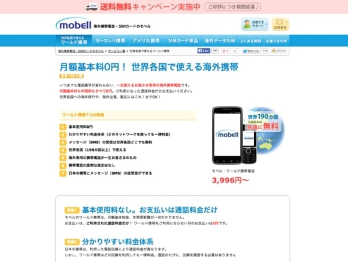
We first came across the “Keitai Denwa” Problem in 2003. Two members of our team were running a cell-phone company that had U.S. and Japanese branches. This is one of the Japanese company’s pages:
Here’s a Google Translate version so that you can understand (roughly) what the page was saying:
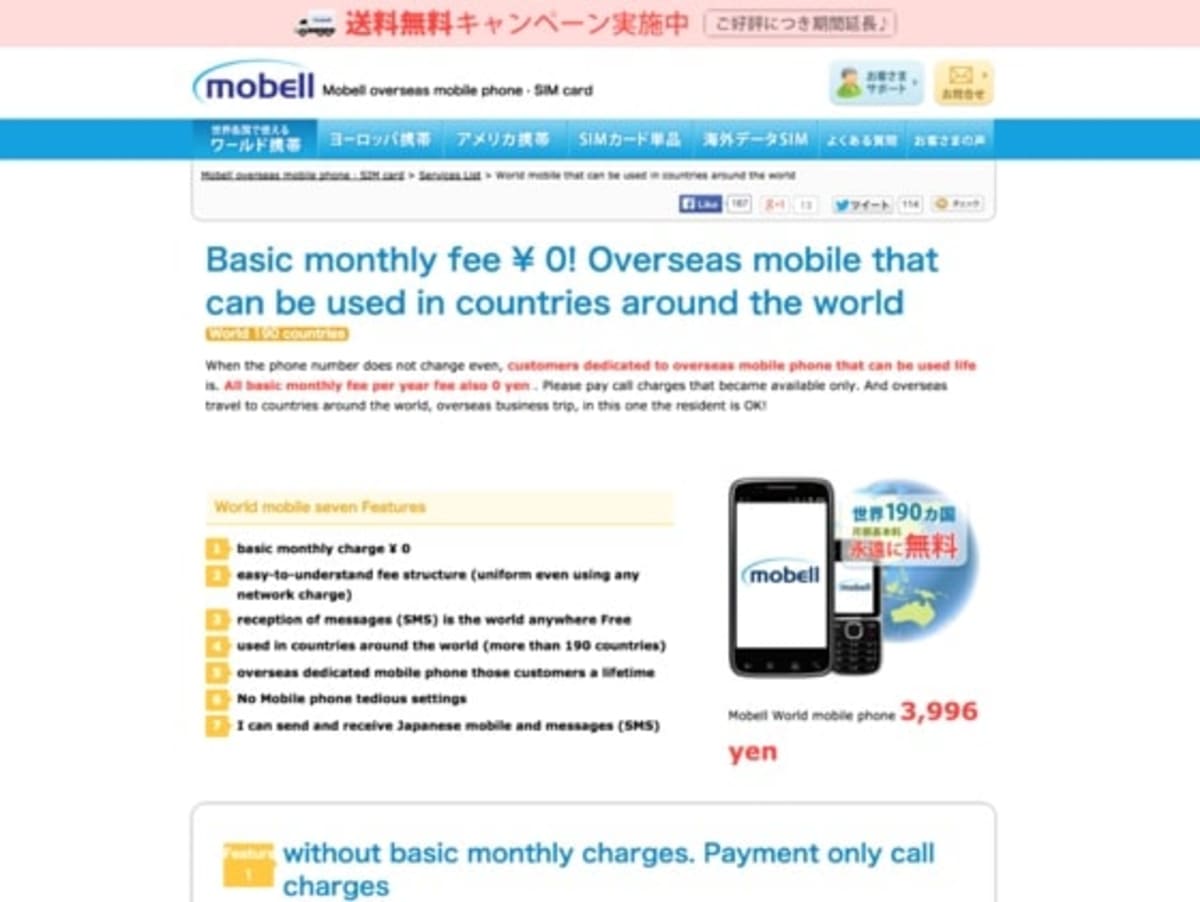
The page sold phones for Japanese people who were traveling abroad. The customers used the phone on their travels and then, when they returned home, they kept the phone in a drawer, ready for their next trip.
Before you read any further, take a moment to think about how you would increase the conversion rate of the page in the image above.
Here’s the punchline to the story: When Mobell installed more advanced analytics on their website (remember this was 2003), our colleagues learned that fewer than 10 percent of the visitors were arriving from the keyword the site was targeting, “kaigai keitai,” (which means “phone rental”). Most of the visitors—more than 90 percent of them—were arriving on this page from the keyword “keitai denwa,” which means “cell phone.”
In other words, the visitors were searching for something that the site didn’t even offer: normal domestic cell phones. This was because, thanks to the focus on SEO, the company was number one in Yahoo! (Japan’s top search engine at the time) for a keyword we hadn’t even targeted.
“Keitai denwa (cell phone)” was a ridiculously valuable ranking to have. Most of the visitors were looking to buy a domestic mobile phone. When they realized that the site only sold phones for travel, they left.
The site had one of the web’s most valuable rankings, but squandered it because the visitors couldn’t buy what they were looking for. It was also an effective way of learning that the only way you can increase a website’s conversion rate is to understand who the visitors are, what they want, and why they aren’t converting. By the time the mistake was discovered, it was too late—the ranking was already starting to slip as domestic mobile carriers caught up.
The “Keitai Denwa” Problem teaches us that you can’t critique a site without knowing about the visitors. You may think that this sounds obvious, but frustratingly, even once you’ve learned that lesson, it’s easy to slip back into making judgments without having the data.

Every day, it takes an incredible amount of discipline to avoid making this mistake—not just when you are writing a webpage, but also when you are giving a talk, selling a product, or even writing an email. It’s possible to learn this rule one day, and then break it the next.
No matter how many marketing techniques you use, you’ll always fail if you don’t know your audience. (See our articles on The five golden questions or User testing for tools and techniques you can use to do that.)
Mistake #2: The “Cinema Foyer Effect”
Sometimes, no matter what you do on a page, you can’t get a win. Nothing seems to move the needle. The tests just stay inconclusive.
The question is “why?”
The answer comes from the world of science. Scientists often carry out what’s called sensitivity analysis, which is a way of measuring which variables are affecting the results and which aren’t.
Imagine you are in a railway signal box, facing a row of thirty levers. Presumably each of the levers does something. When you pull one of them, something happens somewhere else. But now imagine that some of the levers weren’t connected to anything. No amount of pulling them would have any effect on anything.
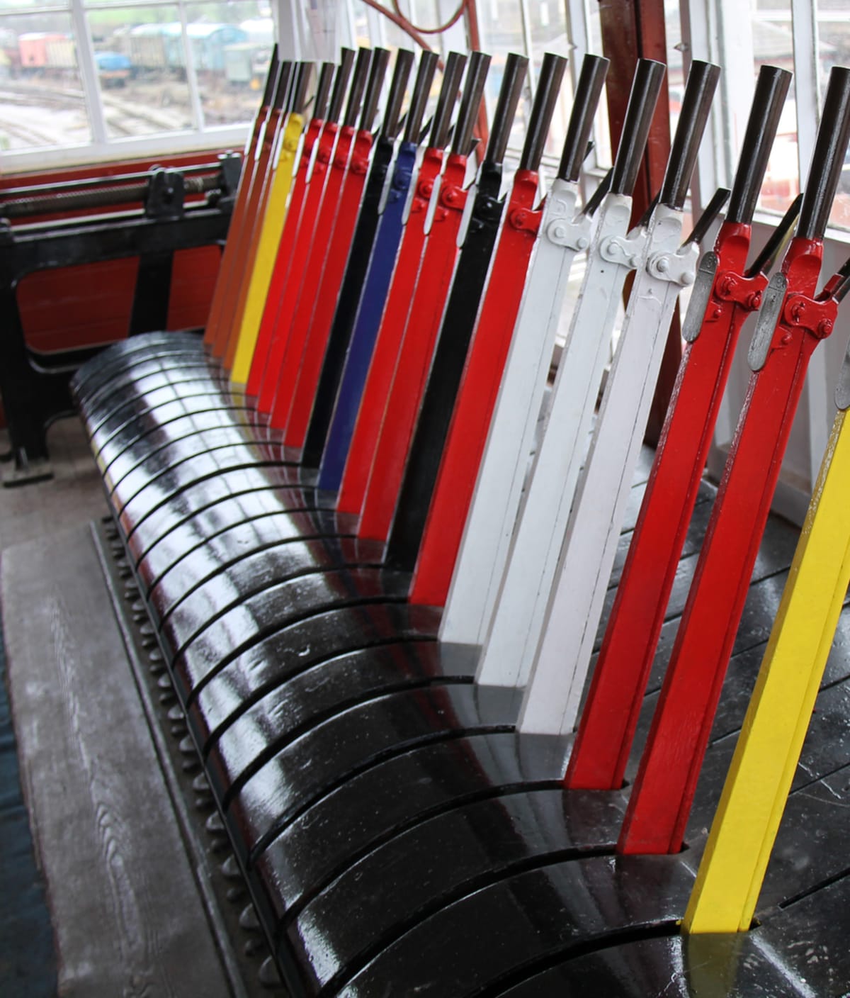
On your website, some of your pages—or page elements—can be like those disconnected levers. Not every page element will change the number of orders you receive, no matter how hard you pull it.

An obvious example would be a page that receives no visitors. If no one ever visits your “Terms and Conditions” page, for example, then no amount of yanking on it will increase your profits because it’s not connected to your goals. That’s an obvious example, but your site will have many other “disconnected levers” on it.
You may even discover that your homepage is a disconnected lever. Sensitivity analysis is about changing variables and spotting which of them are connected to the goal and which aren’t. On a website, many of the page elements aren’t connected to anything and don’t affect the conversion rate, no matter what you do.
We had a client that came to us after a site-wide redesign. The client’s new site had a completely different appearance, but the conversion rate hadn’t changed. It transpired that the whole website, for reasons that we’ll hint at later, was a red herring. We identified the real levers (which was the onboarding process of the software itself) and instead worked on those.
How can you spot this problem? You know you have this problem when nothing you do to a particular page (or page element) makes a difference. All of your tests on it are inconclusive; none of them win, and equally importantly, none of them lose either. For example, you might discover that everything you do with testimonials makes no difference. You’re pulling on a lever that isn’t connected to anything.
A common example of this is what we call the “Cinema-Foyer Effect.” Imagine that you own the cinema shown in the following image.

See the poster for the movie “Rampage” peeking out of the top left? Imagine that on some days you put the “Rampage” poster there, and then on other days you put “A Quiet Place.” Our guess is that the poster would give no measurable uplift to the number of people who go to see “A Quiet Place.” Why? Because if you were to ask the cinema’s visitors how they decided which movie to go to, their answer wouldn’t be, “I looked at the posters, then made a decision.” They would say things like
- “A friend recommended this movie to me.”
- “It was recommended on a movie-reviews podcast that I subscribe to.”
- “It was a Best Picture contender.”
- “I saw the trailer for it last time I came to the cinema.”
- “I saw on IMDb that it has high ratings.”
The posters in the cinema foyer would probably not get mentioned. The posters may have been near to the transaction, but they didn’t influence the decision. The decision happened in the customers’ minds when they saw the persuasive content (the friend’s words, the podcast, the trailer, or the IMDb page). To influence the customer’s decision, you must first identify the persuasive content.
So what can you do?
- Be aware that you will sometimes be barking up the wrong tree.
- Identify where and when the conversions are really happening by watching or talking to your customers.
- Find ways of improving, duplicating and amplifying the content that’s working. Don’t give up just because it’s not in the most convenient place for you.
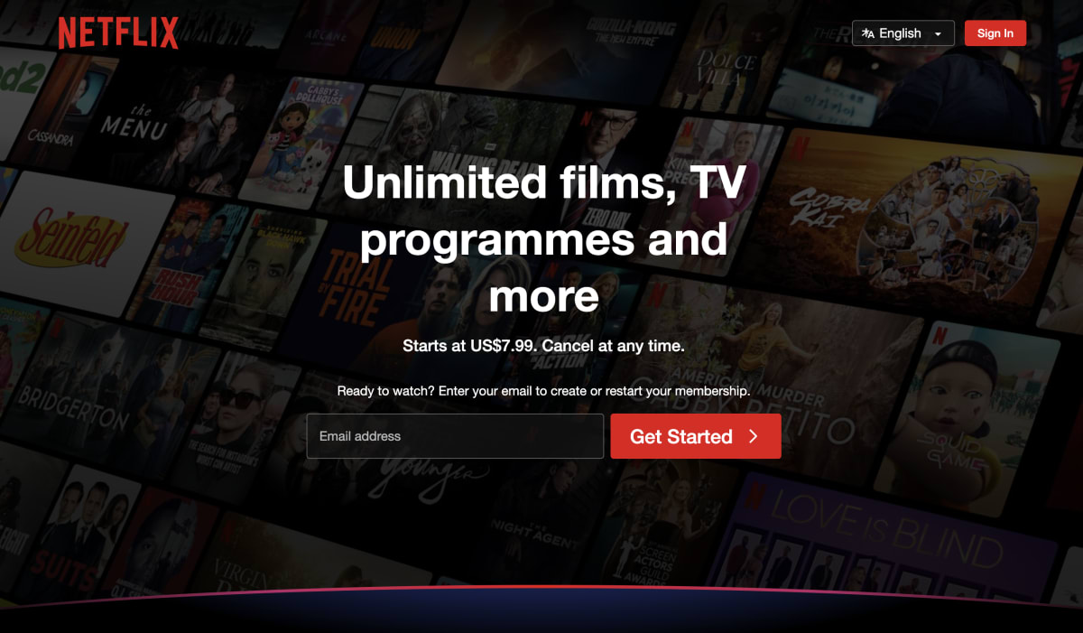
A good example of this phenomenon is Netflix. The top of their homepage contains a sign-up form and very little else. We believe that it’s because, by the time someone arrives at their homepage, they are already persuaded. They aren’t thinking, “Oh, this looks like an interesting service; I wonder what I’ll get.” It’s far more likely that a friend or online reviewer has gushed about one of the shows.
Netflix has discovered that putting persuasive content front and center on the homepage doesn’t significantly impact conversions, presumably due to the Cinema-Foyer Effect. Although they do provide some FAQ-style content further down, the best that Netflix’s homepage can do is skip to the sign-up process. Meanwhile, the marketing team can focus its conversion efforts on identifying what and where the persuasive content is, and amplifying it. Because their service is naturally viral—and because users love it—the marketing team is right to focus on enhancing virality and customer satisfaction. It does so by continually optimizing its referral mechanisms (trailers, shows, and movies) and the usability of the product itself.
So, with your business, identify what and where the persuasive content is.
Mistake #3: Returning customers can cause deafening noise
We discovered this problem with one of our earliest clients, a company that sold health supplements.
We had designed a new landing page for them, which (we felt) was better in every way than the one we were testing against. It felt like we had “cracked the walnut with a sledgehammer.” We had usability-tested it, and the users were emphatic that it was much more persuasive. The page contained mountains of proof and the product’s benefits were explained much better. Then we ran an A/B test… and the page didn’t win.
Our much younger and less experienced selves were utterly confounded… until we realized where we had gone wrong.
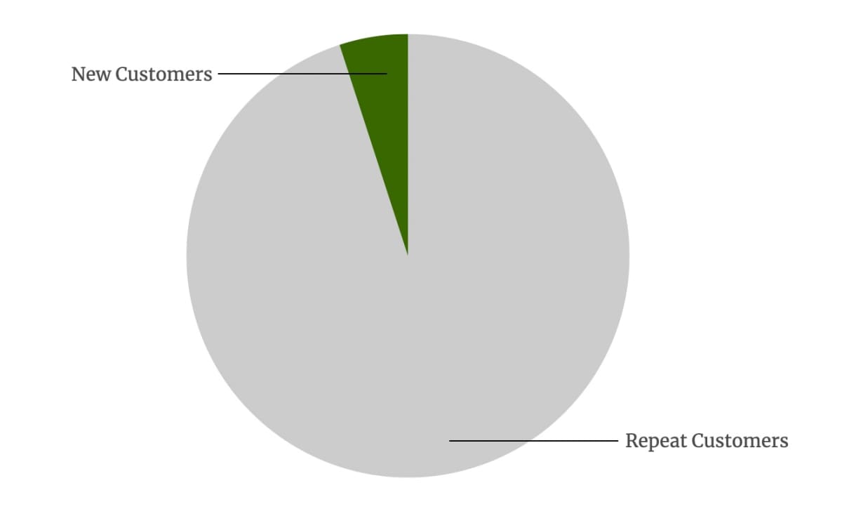
On any given day, about 95% of the company’s customers were repeat customers, people who had previously taken the health supplement and were returning to the site simply because they needed to reorder.
If a customer has already purchased ten bottles of a health supplement and is just returning to reorder, then the only thing the website needs to do is to let them place the order. Nothing on the landing page is going to make much difference. We realized that no matter how persuasive our new page was, the only thing that it could do was to increase the number of new customers—the green guys in the following chart:
So we ran the test again, this time measuring only the number of new customers. This is trivial to do on a website now, but back then we could only do it by analyzing the company’s customer database and tracking new accounts.
By that measure, our sledgehammer page was generating 114% more new customers than the control. We had more than doubled the conversion rate of the page, but our success had been hidden in the noise of repeat customers.
If your business has a lot of repeat users, whether it’s because your service involves existing customers logging in (as with a SaaS company) or because you have many returning customers, then be wary of this problem. Whenever you try to increase the rate of new customer acquisition, ensure that you track the new customers. Otherwise, your successes will get lost in the statistical variation from your existing ones.
Mistake #4: Not having ADA on the project
What do we mean by ADA? ADA stands for authority, duty, and ability. The concept arose from a conversation we had with an online strategist and describes a problem that we see in many companies.
When we speak to a company that’s thinking of signing up with us, we now want to know that the prospect’s team has the following three attributes:
“A” stands for “authority,” the person whose permission must be sought to do all of the following:
- Make changes.
- Make decisions.
- Spend money.
- Do whatever is needed to keep the project moving.
Authority is often missing from a conversion team, usually because the person who has authority has delegated the project to people who don’t.
“D” stands for “duty”: You need one person on the project who is ultimately responsible for increasing conversions.
The other “A” stands for “ability,” the person or people who can either do the work themselves—or control those who can. These tend to be the designers, copywriters, developers and analysts.
If you are setting up a conversion team, ensure that the team has all three of the ADA attributes.
In addition, we notice that the rate of progress of a project is inversely proportional to the number of people on the project; large teams move excruciatingly slowly. We believe that this is for two reasons:
- A large team is a clue that no one knows who has the duty (no one can confidently say, “This isn’t my project”).
- No one knows who has the authority. Beware of people who claim to have the authority but who always “pass decisions by” someone else.
To counter this problem, Amazon’s Jeff Bezos famously instituted the two-pizza rule, insisting that any team should be small enough to be fed with two pizzas.

In terms of lean-ness, you’d ideally have all three ADA attributes within one person, because then there would be no need for lengthy hand-offs, emails, and meetings. As Paul Graham says, “Imagine what Apple was like when 100% of its employees were either Steve Jobs or Steve Wozniak.”
If one or more of the ADA attributes is missing from your team, fix it. Progress will be painful until you do.
Mistake #5: Switching to the beauty lane
Some websites are significantly harder to edit than others—sometimes a lot harder. And that can have a huge negative impact on their ability to improve.
Amazon’s website looks pleasant, but it’s not what you would call beautiful; its design is largely functional. This is true of most successful pure-play web companies (that is, companies that are successful because of their websites, not companies whose websites are being subsidized by other activities). Just look at Reddit, LinkedIn, and Google. They all have a functional design.
Now consider Rolex, which has what you might call an aesthetics-first website. It looks polished and elegant, as do most websites whose primary purpose is branding rather than selling.

We don’t know how hard it is to edit Rolex’s site, but we’re confident it takes more work to make a change than it does on Amazon. You probably couldn’t just say, “Let’s see what happens if we move this image to the left and add some text to the right.” There could be many considerations about the layout, the video, and the text.
To be clear, this isn’t a choice between beautiful and functional design; it’s the choice between websites that are easy to update and those that aren’t. We’ve worked on some beautiful sites that were a joy to edit, but far more often, beauty comes at the cost of flexibility.
The following chart shows why having a hard-to-edit website is so dangerous.
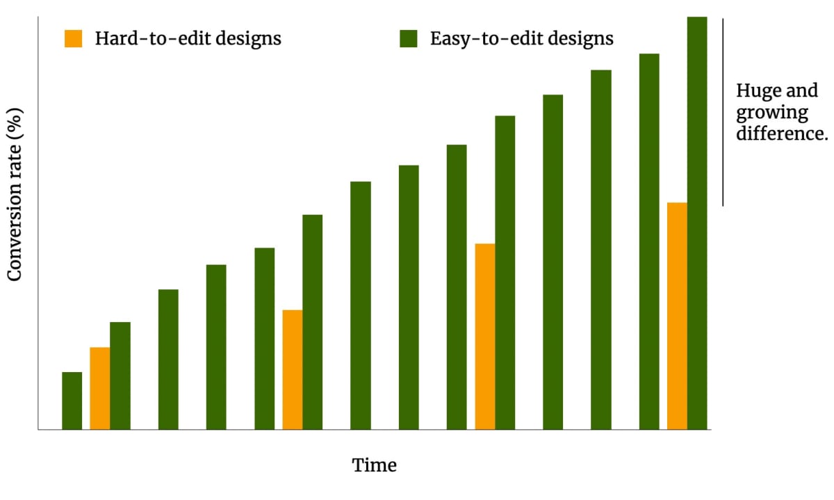
We believe that this graph is profound. The horizontal axis represents time, and the vertical axis is the conversion rate. Start by looking at the green blocks, which represent a website that’s designed for easy editing, like Amazon et al.
Imagine you run an A/B test on your “easy” site and get a win. Your conversion rate rises, as shown by the next green bar. Then you run another test, and you get another win. Each time you run a test, you increase the conversion rate, so those green bars rise like a steep staircase to success.
Now let’s assume you redesign your functional-looking page, making it more beautiful but harder to edit. And let’s assume that your beautiful page wins an A/B test and has a 20% higher conversion rate. So far, so good; your business has grown, and you get a site that you’re proud to show to your friends.
But your next A/B test may take two or three times longer to create because you can no longer simply change the text. Your progress follows that of the orange bars in the chart above. Each time you change a webpage, you need to redesign the graphics, and consider the effects on the layout, and check with the branding department, and discover that you are going to break the intricate CSS tricks that were needed to make the design work across browsers, and then go through several rounds of QA-testing, and discover that you have broken the mobile version… and everyone is blaming each other, and your developers leave, and you wonder why it’s so hard to find good developers these days, and your competitors start to overtake you.
Welcome to the slow lane.
Most companies—certainly more than half of them—are stuck in the slow lane. Their websites become elegant and beautiful—more beautiful than Amazon et al (surely that’s a clue that something’s wrong, no?)—and from then on things move more slowly because every change has to look elegant too. When you move from functional design to beautiful design, you may get an increase in conversion rate, but you do so at the cost of having to make every subsequent challenger page beautiful—otherwise every challenger page will miss out on that 20% beauty lift. The 20% beauty lift becomes a tax on your rate of progress, maybe reducing your implementation rate by 50%, 70% or even more.
Some companies are literally unable to make changes to certain pages because they have wrapped themselves in so much complexity that progress reaches gridlock.
We see this time and time again. It’s really hard to persuade people of the benefits of being agile. The only thing we can point towards is the graph above, to this article we wrote about the subject, and to all those crazily successful companies that we’ve just shown.
Of all of the mistakes that we’ve mentioned, this is the one that happens most often. It’s also infuriatingly hard to prevent people from making it—because the alternative is so alluring.
Your mistakes are precious: Don’t waste them
How do you treat your mistakes?
We ask because, in our experience, one of the surest signs of a highly performing company is what they do when things go wrong. It’s easy to give lip-service to the idea of “learning from mistakes,” but the best businesses create a culture where it actually happens.
And that starts, of course, by talking about the things that haven’t gone well.
While we hope that sharing the mistakes above will stop others making them, we also hope it inspires some businesses to bring their missteps into the light.
Every company makes mistakes. That’s part of the game. But the best ones—the great ones—never make the same mistake twice.
How much did you like this article?
What’s your goal today?
1. Hire us to grow your company
We’ve generated hundreds of millions for our clients, using our unique CRE Methodology™. To discover how we can help grow your business:
- Read our case studies, client success stories, and video testimonials.
- Learn about us, and our unique values, beliefs and quirks.
- Visit our “Services” page to see the process by which we assess whether we’re a good fit for each other.
- Schedule your FREE website strategy session with one of our renowned experts.
Schedule your FREE strategy session
2. Learn how to do conversion
Download a free copy of our Amazon #1 best-selling book, Making Websites Win, recommended by Google, Facebook, Microsoft, Moz, Econsultancy, and many more industry leaders. You’ll also be subscribed to our email newsletter and notified whenever we publish new articles or have something interesting to share.
Browse hundreds of articles, containing an amazing number of useful tools and techniques. Many readers tell us they have doubled their sales by following the advice in these articles.
Download a free copy of our best-selling book
3. Join our team
If you want to join our team—or discover why our team members love working with us—then see our “Careers” page.
4. Contact us
We help businesses worldwide, so get in touch!
© 2026 Conversion Rate Experts Limited. All rights reserved.
A Brandwidth Group Company.


