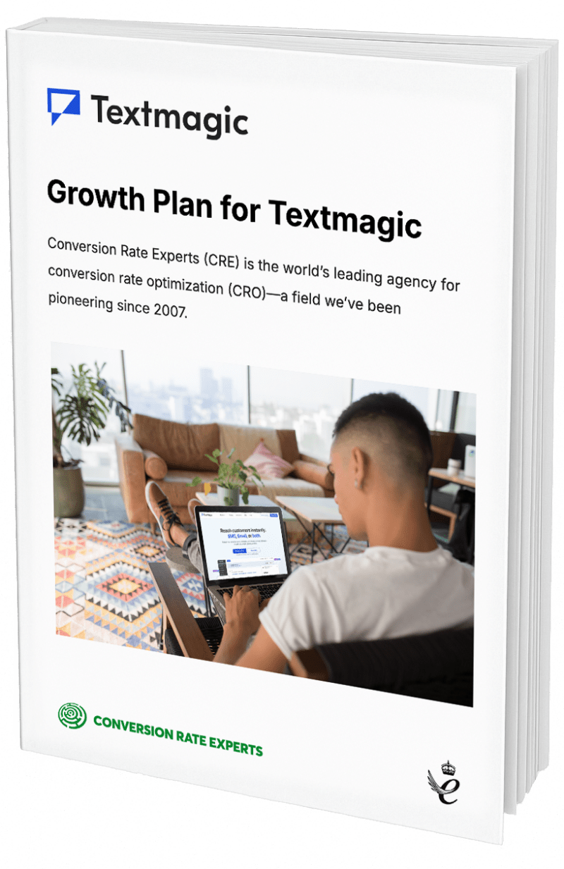
Conversion Killers: The Definitive Guide
(By the way, to get articles like this free in your inbox, subscribe to our newsletter.)
How to identify yours, and how to fight them.
This is the first in a series of articles, in which we reveal the conversion killers that are most likely to be wiping out your profits. You will
- Discover the 15 most common conversion killers. Your company’s nemesis will almost certainly be on the list.
- Get a mental model for understanding how to increase your website’s conversions. (Most people see it backward.)
- Discover how to identify which killers are currently massacring your conversions. (If you can’t spot your killers, you can’t defeat them.)
- Learn effective strategies for overcoming each killer and growing your profits.
This series of articles began life as a conference talk. Even if you saw the talk, you will benefit from reading the articles, because they contain many more resources and examples.
To skip to another article in this series…
- #1: Introduction and the first Conversion Killer: Not A/B testing: On this page (scroll down).
- #2: Why DiPS (Diagnose → Problem → Solution) thrashes meek tweaking
- #3: If your visitors can’t understand you: The 11 best resources for improving your writing—including an amazing book that hardly anyone knows about.
- #4: Usability: How to eliminate the usability problems that stifle your growth.
- #5: What if you aren’t satisfying visitors’ intentions: How to use gap analysis to gain an unfair advantage over your competitors.
- #6: Why many visitors don’t buy because they don’t understand what they’ll get: How to increase your conversion rate by fixing three of the most common problems with value propositions.
- #7 and #8: What if your visitors don’t trust you or your products? Highly effective ways to improve your company’s credibility (and sales).
- #9: A template to help you convert visitors who are “just browsing.” An easy way to design unbeatable multi-step conversion funnels.
- If your product or service is complex:
- #10a: A simple template for managing visitors’ objections. How to identify great counter-objections. And how to know if you should use long or short copy.
- #10b: How to organize your persuasive copy (using “separation of concerns,” modularization, and labeling). And how to fix your headings by turning them into “teasers” or “spoilers.”
- #10c: How to use “progressive disclosure” to stop your visitors getting overwhelmed and abandoning. And how to convert visitors who can’t find what they need.
- #11: How to beat your competitors. And how to have fewer of them. Crucial techniques you need to survive in ultra‑competitive markets.
The slides
Why you need to identify your company’s conversion killers
To every client we apply the CRE Methodology, which begins with us researching the client’s visitors, to understand
- What makes them tick.
- What stops them from ticking more often.
- How we can increase their dollars-per-tick (we might be straining the “tick” analogy here).
Fortune magazine described our approach as “a combination of multivariate statistical analysis and good old-fashion detective work.”
The research allows us to identify exactly why web visitors buy.
Or don’t.
This series of articles is about the “don’ts.”
You should know how to spot each of the following killers. And you should know how to overcome each of them.
Any conversion practitioner should be able to quickly recognize each conversion killer when they see signs of it in research data. Some of the killers are subtle; if you miss them, you will waste your time working on the wrong aspect of your business. We see this happen a lot.
A good conversion practitioner should also know many strategies for overcoming each killer. For example, there are over a hundred ways of overcoming Conversion Killer #7 (“Lack of trust in your company”), and some of them are much more effective than others. For each killer, we will describe strategies that are interesting, little known or often overlooked.
Conversion Killer #1: Not A/B testing
Almost all the conversion killers are about visitors’ behavior. But the first two are about how you behave. The first killer is you if you aren’t A/B testing the changes you make to your website. If so, you aren’t alone. Most businesses make major changes to their websites without testing them. In fact, even companies that own A/B testing software often don’t use it. It just sits on their servers gathering virtual dust.
The remedy
In our article about web design, we explain why (and how) the most successful web companies work. Testing is part of their standard workflow. If you aren’t running A/B tests, you should read it now.
If you don’t already have A/B-testing software, this article shows you what your options are.
Read the next article in this series
This article is the first in a series. The next part is here.
How much did you like this article?
What’s your goal today?
1. Hire us to grow your company
We’ve generated hundreds of millions for our clients, using our unique CRE Methodology™. To discover how we can help grow your business:
- Read our case studies, client success stories, and video testimonials.
- Learn about us, and our unique values, beliefs and quirks.
- Visit our “Services” page to see the process by which we assess whether we’re a good fit for each other.
- Schedule your FREE website strategy session with one of our renowned experts.
Schedule your FREE strategy session
2. Learn how to do conversion
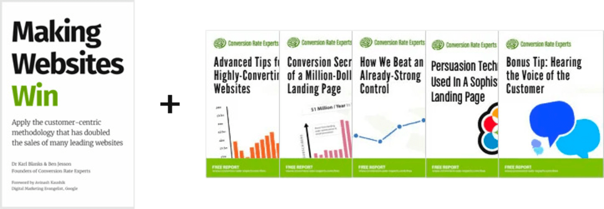
Download a free copy of our Amazon #1 best-selling book, Making Websites Win, recommended by Google, Facebook, Microsoft, Moz, Econsultancy, and many more industry leaders. You’ll also be subscribed to our email newsletter and notified whenever we publish new articles or have something interesting to share.
Browse hundreds of articles, containing an amazing number of useful tools and techniques. Many readers tell us they have doubled their sales by following the advice in these articles.
Download a free copy of our best-selling book
3. Join our team
If you want to join our team—or discover why our team members love working with us—then see our “Careers” page.
4. Contact us
We help businesses worldwide, so get in touch!
© 2026 Conversion Rate Experts Limited. All rights reserved.
A Brandwidth Group Company.