How to sell complex products and services (Part 2)
(By the way, to get articles like this free in your inbox, subscribe to our newsletter.)
—Includes how to organize your persuasive copy (using “separation of concerns,” modularization, and labeling)
—Plus, how to fix your headings by turning them into “teasers” or “spoilers”
(This is one of a series of articles, the first of which is here.)
In our last article, we described Steps 1 and 2 for selling complex products and services.
And we explained why some webpages need a lot of words.
However, no matter how long your page is, your visitors should be able to easily find the information they need. They shouldn’t have to read the whole page from start to end. A webpage should be long like a phone book, not like a Russian novel.
Your challenge is thus one of information architecture: How can you organize all the information so that visitors see what they need—and at the right level of detail—without getting bored? This is conversion at its hardest. It’s also extremely fruitful when you get it right. In the following sections, we present some techniques and concepts that don’t appear in copywriting books. They will help you a great deal.
Step 3: How “separation of concerns” can prevent your website from becoming a disastrous mess
“Separation of concerns” is a fancy name for when information is organized and encapsulated into modules. The concept is closely related to the phrase “a place for everything and everything in its place.” Separation of concerns is essential when you’re managing a lot of content. For website design, the modules can be paragraphs…
…or page sections…
…or pages, or groups of pages…
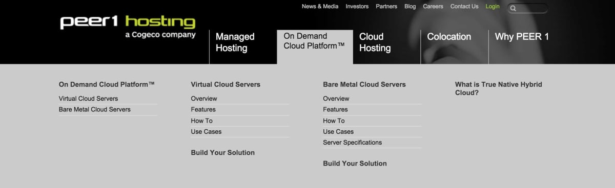
…or several levels of nested information:
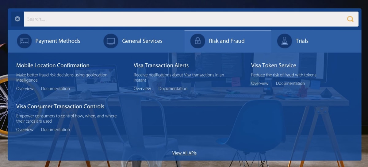
By modularizing, you allow your visitors to easily find the information that they need, and to ignore the rest.
It’s hard to stress how important it is to organize information into an architecture that’s easy to navigate. Once a visitor is lost, it’s difficult to show them counter-objections. They’ll never find them.
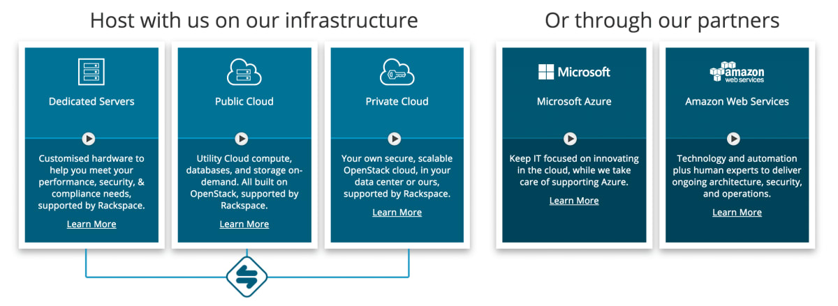
Separation of concerns may seem obvious and straightforward, but once a company does it badly, a mess quickly ensues. We are fans of Ergotron sit-stand desks. You can see ours here:

However, whenever we recommend them to people, we struggle to find the right one on Ergotron’s website:
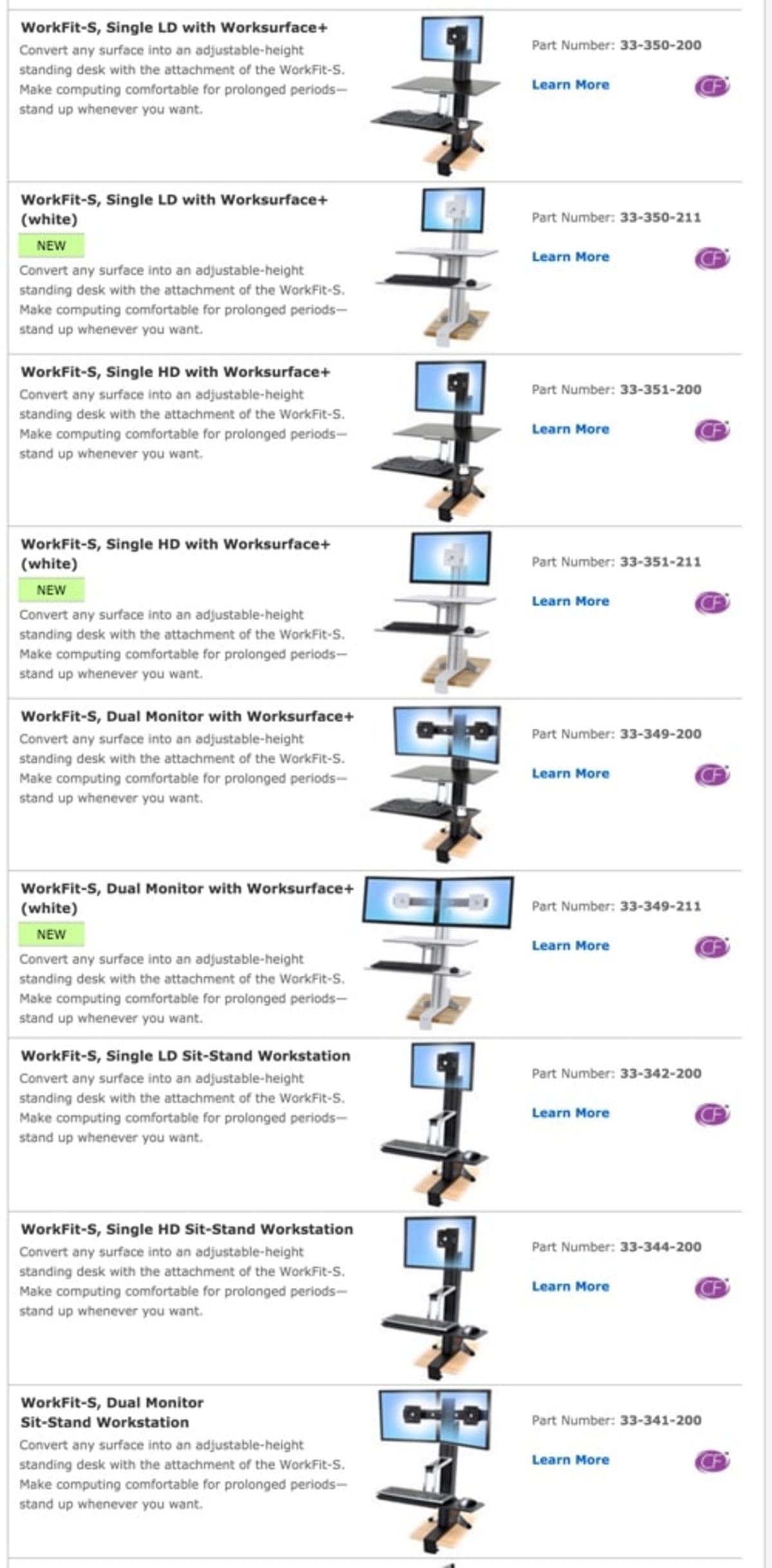
That’s because Ergotron has given each product variation its own page. The visitor therefore has to play a game of spot the difference between different product pages, many of which are almost identical except for a few differences. Most users don’t want to see product names like “WorkFit-S, Single LD Sit-Stand Workstation.” Instead, they prefer to see headings that reflect their current mindset, and which narrow down the choices—like “Do you have one display screen or two?” and “Is your desk in the corner of a room?”
The following hack is useful if you are unsure of the logic by which your products or services should be sold: Phone the company’s sales department, and ask an open-ended question like “I’m having trouble choosing which sit-stand desk to buy. Could you help me?” Then notice which questions the sales advisor asks. If they are good, they’ll ask questions that narrow down the choices. If they are great, they’ll have a mental logic tree that elegantly narrows down the choices in as few steps as possible. They almost certainly won’t ask what the website asks: “Do you want Product ABC, Product DEF or Product GHI?” Only a web marketer would do that.
There’s one more reason to clearly modularize your content: If information is hard to find for a visitor, it will also be hard to find for the website’s editors. So it will be even more likely to deteriorate over time. Poor separation of concerns tends to snowball. Some telecoms companies’ websites are messy to the point of being almost irrecoverably out of control.
Step 4: Make it clear where one module ends and the next begins
Once your information is clearly modularized, you need to make it clear where one module ends and the next starts.
You can do this using a hierarchy of text sizes and formatting, as we do in the article you are currently reading, using the following techniques:
- Headings (and sub-heads) clearly show the start of sections (and sub-sections). However, be aware that readers tend to be less aware of the structure than the writer is. Readers are typically fine with Heading 1 and Heading 2 styles, and tend to be just about okay with Heading 3 styles. By the time an article has reached Heading 4 or below, the readers often struggle to understand where they are in the hierarchy.
- Paragraph returns indicate minor changes of topic.
- The opening sentence of a paragraph often introduces the theme of the paragraph.
- Text in bold (like this) reveals key points, to help skim-readers. (This article contains many examples.)
- Bullet-point lists (like this one) represent parallel ideas.
Another way to group information is to add background colors to page sections:
Another way to demarcate sections is to put information into boxes:
Step 5: Optimize your navigation
Good navigation helps users to find the information they are seeking. Navigation elements include horizonal and vertical navigation bars, tabs within pages, and on-page Johnson boxes (like the list of links near the top of this page).
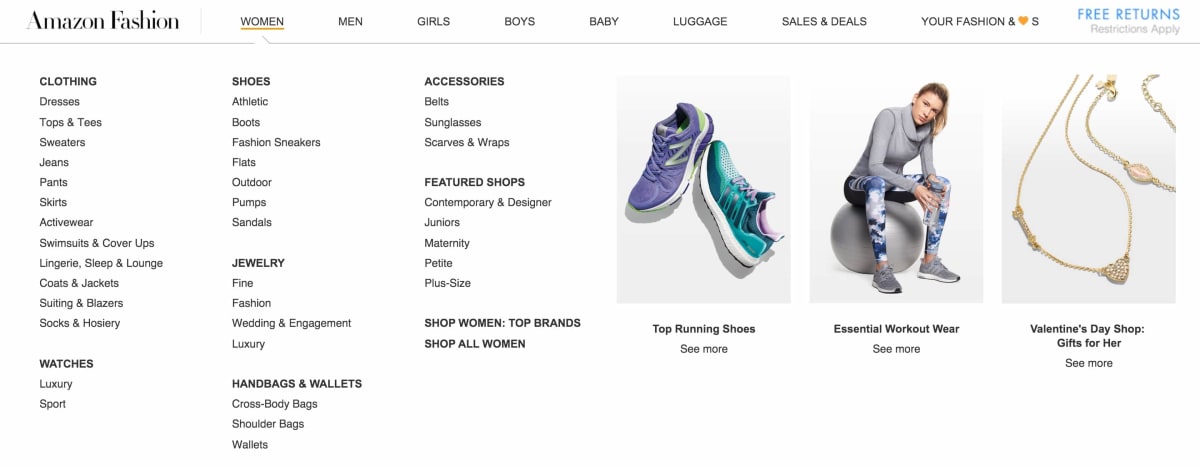
Your navigation should reflect how your visitors would expect to find things. In the case of Amazon’s “fashion” department, for example,
- users first expect to segment by age/gender (e.g., “Women”)
- and then by type of product (e.g., “Clothing”),
- and then by sub-category (e.g., “Dresses”).
The following example shows the navigation bar of StudentPosters.co.uk, which chose to organize its navigation in a novel way:


The example above demonstrates again that the modularization should reflect the visitor’s mental model—not the mental model of the website’s creator.
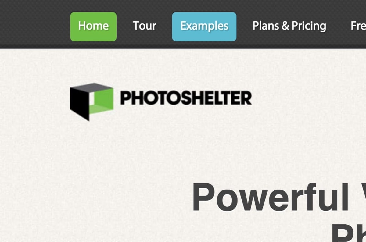
When we doubled the sales of the web app PhotoShelter, we managed to grow the sales by 12% by optimizing the navigation:
If you are unsure how to organize your information, OptimalSort is software that allows your users to do it for you. In this article, we describe what we like about it.
Step 6: Two ways to improve how you label modules
1. Label each module with a headline that’s clear and descriptive
It’s important to use the right words in a section’s heading. Your words should concisely describe the contents of a section in a way that will be obvious to visitors.
The navigation in the following example from Vincent Flanders is outrageous:
Fortunately, quacking spinning cheese cubes never caught on. But a lot of navigation makes a similar mistake. The right-hand section (see below) in Microsoft’s navigation bar can be understood only by someone who’s already familiar with the products:
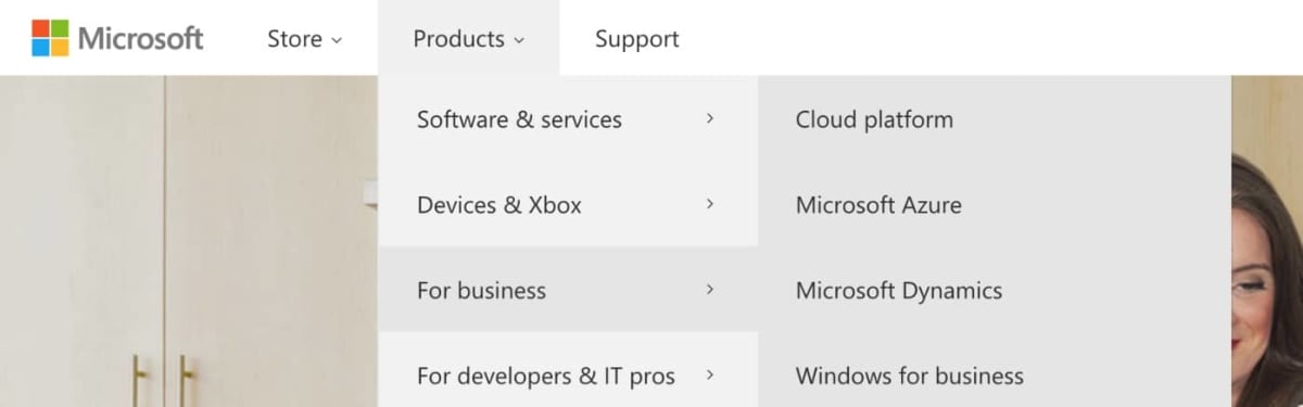
To a newcomer, the links “Microsoft Azure” and “Microsoft Dynamics” can’t be understood until after they have been clicked. Visitors who are new to the products might as well be clicking on spinning cubes of cheese.
You might find it useful to think of the above as “Kinder Surprise navigation”—named after the chocolate eggs that have mystery toys inside them. With Kinder Surprise navigation, you don’t know what you’re going to get until you’ve got it.
A visitor to Vincent Flanders’ website wrote…
“It’s like a company’s answering machine saying, ‘You’ve reached XYZ Corporation. To hear what option #1 is, press 1. To hear what option #2 is, press 2.’”
One might argue that some navigation is only for experienced visitors. In our experience, it’s more profitable to make pages accessible to newcomers too.
Kinder Surprise navigation isn’t limited to navigation bars; it also applies to the headings of any page section. In the navigation bar above, if you were to select “Microsoft Azure,” you’d arrive at the following page, which has a Kinder Surprise headline: “Azure Friday.”
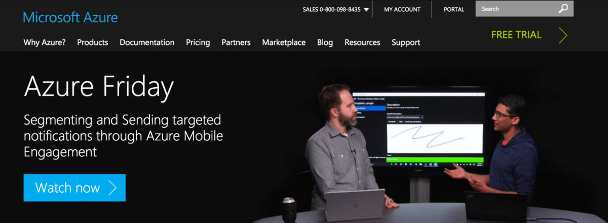
Kinder Surprise navigation makes sense only in hindsight.
It’s a common problem; it leads visitors into oblivion, and it kills conversions.
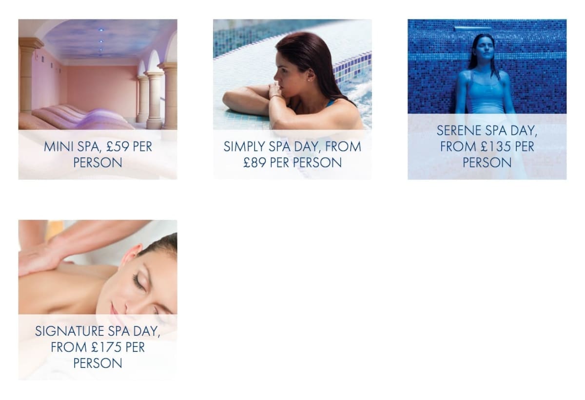
Here’s another example of Kinder Surprise navigation, this time for a spa resort. Notice how it’s impossible to discern what each option means without clicking on it:
The solution: Read all of your headings, including the tabs in your navigation, the heading of pages, and the headings of sections. Ensure that each heading would be understandable to a newcomer. Then, confirm that you were right
- by carrying out user-tests
- using Treejack, which allows you to test your information architecture on users, to see if they can find what they are looking for. We describe Treejack in this article.
2. Many marketers mistakenly label modules with “categorizers” when they should have used “spoilers” or “teasers”
It’s often not enough for a heading to describe what’s in the module. It should also tease or spoil.
So if your page has a section of media testimonials, introduce it with a spoiler headline. That way, you communicate the message even to skim-readers:
- Categorization headline: “Media mentions” (Worse)
- Teaser headline: “See what the press are saying about us…” (A bit better.)
- Spoiler headline: “We’ve had rave reviews from TIME, CNN and many others!” (Much better)
If you definitely want the user to click through, use a headline that teases, not spoils:
- Categorization headline: “A video of a cat pouncing on an owl.” (Worse.)
- Spoiler headline: “A cat pounced on an owl in a playful way, because they are friends.” (No better.)
- Teaser headline: “A cat pounced on an owl—I was ready for an ugly ending. What happened next is incredible!” (Better)
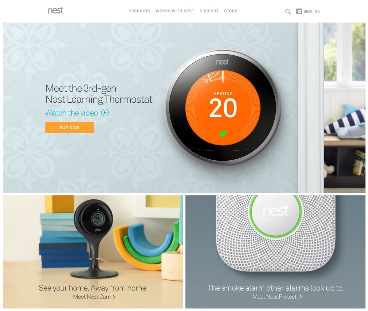
Even many professional copywriters make the mistake of using categorization headlines when they should have used spoiler or teaser headlines:
- Categorization headline: “Meet the 3rd-gen Nest Learning Thermostat” (Worse)
- Teaser headline: “The 3rd-Generation Nest Learning Thermostat. See how we’ve made the best even better.” (Better)
- Spoiler headline: “Meet the 3rd-Generation Nest Learning Thermostat: Now it controls your hot water, it’s even more beautiful, and it’s easier to use.” (Better)
Read the next article in this series
This article is one of a series that began here. The next in the series is here.
How much did you like this article?
What’s your goal today?
1. Hire us to grow your company
We’ve generated hundreds of millions for our clients, using our unique CRE Methodology™. To discover how we can help grow your business:
- Read our case studies, client success stories, and video testimonials.
- Learn about us, and our unique values, beliefs and quirks.
- Visit our “Services” page to see the process by which we assess whether we’re a good fit for each other.
- Schedule your FREE website strategy session with one of our renowned experts.
Schedule your FREE strategy session
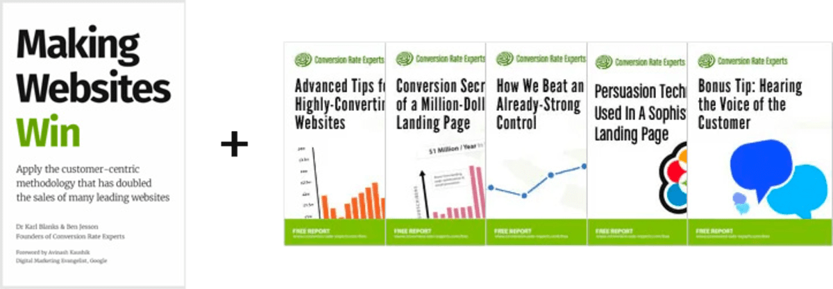
2. Learn how to do conversion
Download a free copy of our Amazon #1 best-selling book, Making Websites Win, recommended by Google, Facebook, Microsoft, Moz, Econsultancy, and many more industry leaders. You’ll also be subscribed to our email newsletter and notified whenever we publish new articles or have something interesting to share.
Browse hundreds of articles, containing an amazing number of useful tools and techniques. Many readers tell us they have doubled their sales by following the advice in these articles.
Download a free copy of our best-selling book
3. Join our team
If you want to join our team—or discover why our team members love working with us—then see our “Careers” page.
4. Contact us
We help businesses worldwide, so get in touch!
© 2026 Conversion Rate Experts Limited. All rights reserved.
A Brandwidth Group Company.