A/B testing 101: A quick-start guide to conversion rate optimization (CRO)
(By the way, to get articles like this free in your inbox, subscribe to our newsletter.)
—How to get lots more customers—free—using A/B testing software
—Includes a list of 108 ways to increase your website’s profits
Using A/B testing software is a powerful way to increase your website’s conversion rate (that is, its ability to turn visitors into customers). Many of the web’s most powerful companies, including Amazon and Google, use this technique. Here’s our essential guide to increasing your conversion rate using A/B testing software. It contains 108 simple techniques for growing your business.
First, what does A/B testing software do?
If you had two possible headlines for your webpage but couldn’t decide which one to use, you could run an A/B test in which
- Half of your visitors would see Headline A, and
- The other half would see Headline B.
You could then tally the orders for each headline and determine which headline brought you the most.
The A/B testing software lets you carry out tests like this, although such tests often take several weeks to finish.
Multivariate testing, however, allows you to carry out many such tests concurrently!
For example, while you are testing which headline to use, you can also test many other page elements (such as text, images, prices, offers, and buttons)—all at once. Each of your visitors will see a different combination of these elements, and then the multivariate-testing software will work out, on average, which of the elements performed the best. This information will help you put together a high-converting “super-page.”
For example, if we were to use multivariate-testing software on the following page, we could test the following:
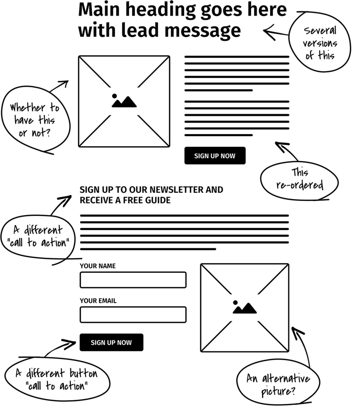
And we would be testing these variables all at the same time! Not only that, but the multivariate-testing software would tell us which version of each page element, on average, brought in the most customers!
Powerful, isn’t it?
A little later, you’ll find a link that allows you to compare software platforms.
If you read this entire article…
…you’ll know more about conversion rate optimization (CRO) than 99% of web marketers!
What is conversion rate?
When we say “conversion rate,” we mean the percentage of your visitors who end up reaching a given goal. Maybe the following image will help:
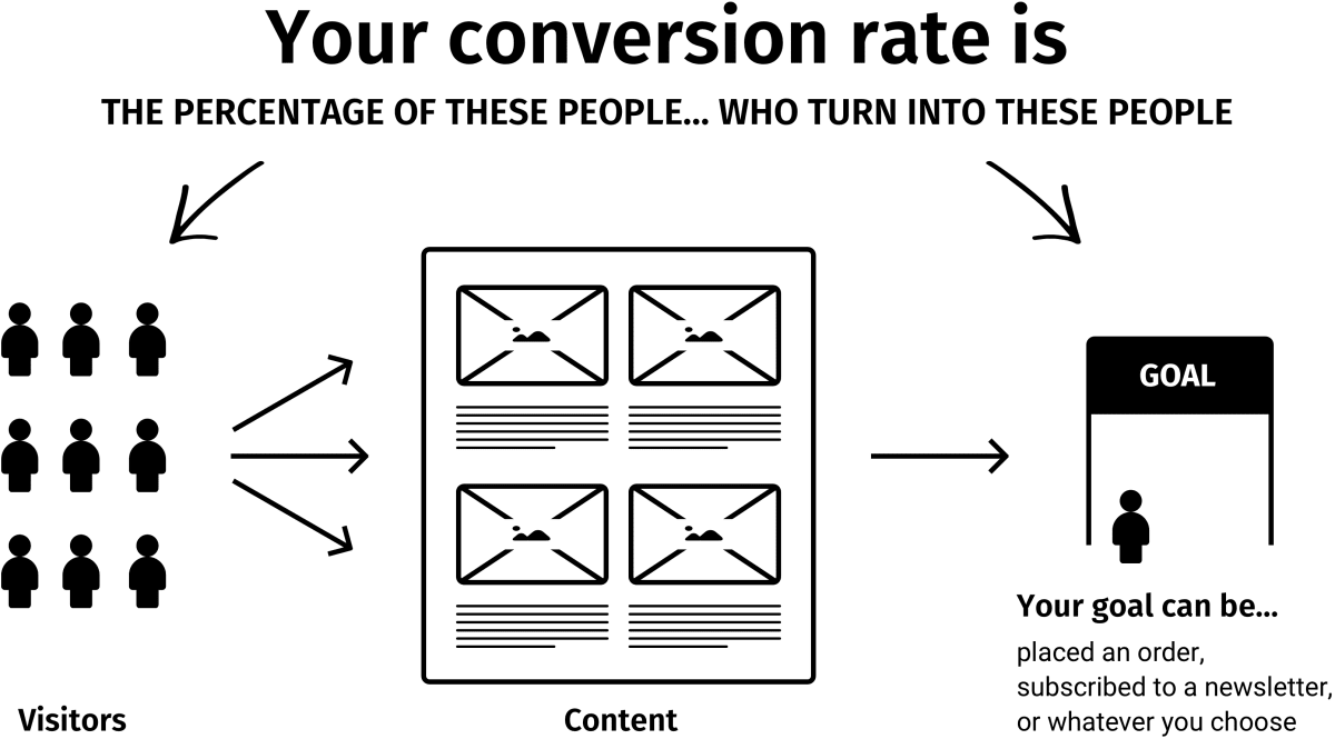
Typical goals include making a purchase, submitting an inquiry form, and signing up for a free newsletter. (Speaking of newsletters, make sure to sign up for our newsletter. It’s as useful as this article.)
Why you need to increase your conversion rate
You need to make conversion rates your number-one priority for these three reasons:
- There’s lots of room for improvement. Most websites are losing buckets of money every day because they do an atrocious job of selling products or services to their visitors.
- Paid search will keep getting more competitive. And increasing your bids is not the answer.
- A/B testing software is now highly affordable. A/B testing software allows you to test changes to your website—and tells you which changes brought in the most customers.
Unfortunately, though, A/B testing software doesn’t tell you what to test. That’s where our expertise comes into play. And this whole website gives you a taste of what we can do.
Some exciting benefits of increasing your conversion rate
If you double your website’s conversion rate, you will halve your “cost-per-acquisition” (CPA). This tool shows you how much extra you’ll earn. (By the way, CPA means how much it costs to get each new customer.)
When your conversion rate does increase, however, we recommend you don’t just sit back and enjoy the profits (tempting as it might be to do so). Instead, we recommend you take advantage of the fact you can now afford to pay twice as much per visitor. This means
- You can pay about twice as much per click on Google Ads, which can bring you a disproportionate number of additional visitors.
- You can start advertising in media that had previously been too expensive for you, such as
- Full-page magazine ads
- Newspaper ads
- Direct mail
- Radio ads
- TV infomercials
- Your affiliates can earn twice as much as before, and this will cause the large affiliates to leave your competitors and join you.
- As the number of orders skyrockets, your company gets greater bargaining power with its suppliers, so its cost-per-unit-sold tends to fall—so the company becomes more efficient because of economies of scale. This means the boost to your net profit is deceptively high.
In summary, if you increase your conversion rate, your business will grow much more than you might expect!
Why many companies can double their conversion rate
What’s your current conversion rate? 5%? 10%? Don’t know? A 10% conversion rate means that of every ten visitors to your site, nine walk away empty-handed. Do you really believe you couldn’t lower that number to eight out of ten?
Look at it another way: To double your conversion rate, you just need to increase the conversion rate of your
- Ads by 19%
- Homepage by 19%
- Product page by 19%
- Shopping cart by 19%
(Note that the figure is 19%, not 25%, because each improvement compounds upon the previous one.)
These increases may sound daunting, but to increase your homepage’s conversion rate by 25%, for example, you would have to make just a 2.27% improvement to ten aspects of your website. For example:
- Your company’s tagline
- Your headline
- Your introductory text
- Your offer
- Your guarantee
- Your picture
- Your readability
- Your usability
- Your navigation
- Your products
- Your pricing
- Your offers
- Your premium (covered in Tip 45)
- Your testimonials
- Your call-to-action
- Your site layout
- Your return policy
- And the list goes on
Does a 25% increase sound more achievable now?
In summary, once you’ve finished reading this article, you need to clear your desk and start working on increasing your site’s conversion rate—and hope your competitors aren’t reading this too.
Will these techniques work for YOUR website?
Yes!
We have applied these techniques to almost all kinds of websites, such as
- Business-to-business (B2B) and business-to-consumer (B2C) websites.
- Websites in diverse industries, including finance, health, travel, technology, leisure, and food.
- Websites of all sizes, from start-up to enterprise level.
- Websites that sell physical goods, services, and information.
- Websites for merchants, affiliates, publishers, and e-commerce stores.
108 ways to improve your conversion rate
Here we go! These are some of the techniques we’d use if we were working on your site.
A word of warning: Don’t be daunted by this list! If you did everything on it, you’d probably be the best marketer in the world! In reality, doing just one of these 108 things could be enough to double your conversion rate. The most important thing is to do something—now!
So, let’s get started!
Your profit-exploding toolkit
First, you’ll need to choose the kind of testing to do:
- Time-split tests (also known as “before-and-after tests”). These stink. We put them on the list only so we could mention how bad they are. If your orders go up and down week by week (and whose don’t?), time-split tests tend to lead to wrong decisions.
- A/B tests—Many times, a simple A/B test is all that’s needed.
- Multivariate testing—Which multivariate software should you use? The following platforms tend to be popular with our clients: VWO, Optimizely, Adobe Target, and Sitespect. If you’d like much more detail, see our comparison table of A/B testing software.
A/B testing software becomes much more powerful when you use it alongside other tools. Here are the other tools and techniques you’ll need in your marketing arsenal:
- Google Ads—Google Ads are valuable as a targeted source of traffic, but they can also be used to run A/B tests by creating two identical ads with different destination URLs. However, for several reasons, it’s difficult to create a controlled scientific test with them, so we don’t recommend using Google Ads to carry out A/B tests.
- Live Chat—Few tools tell you anything about your “non-customers”—that is, the visitors who arrived at your site but then left for whatever reason. You rarely get feedback from these people. They are unlikely to call you, but you might just persuade them to use a Live Chat feature.
- Web analytics—At the most basic level, the “Site Overlay” feature tells you where visitors to your site click, where they don’t click, and where they are when they leave your site. We’ve heard web analysts say, “There are piles of gold waiting for you in your log files,” and they are right—in a vague, over-poetic kind of way. It turns out that you can learn a lot from your web analytics package.
- Usability testing—You can carry out this testing on pretty much anyone you can get your hands on. These tests are gold dust—literally. If we could have just one testing tool, it would be usability testing. Web analytics tell you what visitors are doing, but usability testing tells you why. No other tool provides so many head-slapping, “I can’t believe I didn’t think of that” moments. For some great usability tips, see How to eliminate the usability problems that stifle your growth.
- Here’s a clever one: In your “Refer-a-Friend” program, allow customers to send a personalized note to their friends. You will have access to these notes (privacy notice permitting), and they are a goldmine of information about why a particular customer ordered. In addition, you get to see the exact words customers use to sell your product to friends. It’s like having a team of free copywriters on tap.
- Eye tracking—This tool shows you which things visitors to your site see but don’t click on. And it tells you which things they don’t click on because they don’t see them. Got that? Most eye tracking is carried out using custom hardware, so you need to get a company to do it for you.
- “Poor-man’s eye tracking”—About five seconds into each usability test, ask testers what they have looked at so far. They usually find it easy to tell you.
- Click mapping—A click map is an image of a page that’s annotated with information about where visitors clicked. Here are two good options:
- Crazy Egg is a service that allows you to see the parts of your page that your visitors click on, and how far down your pages your visitors scroll.
- ClickTale is similar to Crazy Egg but allows you to view Flash movies of your visitors’ browsing sessions. You can see how far visitors scroll down your pages, view how they interact with your forms, and learn about many other aspects of their visit.
- Customer surveys—Your customers know why they ordered. And why they nearly didn’t. Ask them about it. Many survey services are available. SurveyMonkey is very widely used.
- Co-opetition—Short for “cooperative competition,” this is a technique by which you sell your competitors’ products from your website (usually via an affiliate program). Co-opetition can teach you a lot about your competitors’ conversion rates. And if your visitors prefer your competitors’ products, this is an easy way to find out!
Think like a master-tester
Here are some tips for getting into the right mindset:
Stop having debates with your colleagues about who likes what. If in doubt, test. Your mantra should be “Let the customers decide.”
Start to think of your business as a constantly shifting experiment. By continually carrying out tests, you will learn which factors increase your profits and which don’t.
Learn your other new mantra. When your colleagues object to the changes you’re making, remind them that this is just an exploratory experiment to “learn what happens,” not a long-term decision. Let this become your mantra: “It’s just an experiment; it’s just an experiment.”
Copy what works for others (within limits). In particular, copy companies that appear to be tracking and testing. You can spot them because they are using the techniques in this list.
Copy the techniques that marketers, who have been testing for decades, have developed; that is, copy direct-response advertisers. The internet may be new, but your visitors aren’t. For about 100 years, direct-response advertisers have been running A/B tests to find out what works. It’s easy to spot their ads in magazines, newspapers, and direct mail—they have tracking codes and coupons in the bottom corner. And the ads often look a bit cluttered.
Place bets with your colleagues about which test sample will win. You’ll be amazed at how often you are wrong. Only the top few percent of marketers appreciate that it’s impossible always to spot the winner. Race to become one of them.
Make sure you have great people working on this project. CRO is one of the most important activities in your company. You have three options:
- Do it in-house with your best staff.
- Get experts in and do it in-house.
- Outsource it to an expert who has a vested interest in making it a big success.
Locate (or become) your company’s best salesperson. Your website is your electronic salesperson. It has the advantage of being able to sell to thousands of customers at the same time. However, only person-to-person selling will teach you the reactions of prospects to certain types of arguments and approaches. It is by far the quickest and most effective way of finding out what appeals to your prospects and what doesn’t. The words on your website need to have been tested on real people. No amount of online testing will give you this gut feel. So, you have a choice: Either become your company’s best salesperson or seek out the best salesperson and listen to how that person sells the product.
Don’t test the small stuff. Test big, bold changes. This has two advantages:
- You’ll get the results quicker (it’s a statistics thing).
- You’re more likely to achieve improvements.
Test changes in two stages:
- Fix all the “broken” things (which you’ll discover during your usability testing). This is worth doing first, because it’s the easiest way to make quick improvements.
- Test new ideas that could significantly grow your business. Do this next.
Don’t worry about temporarily lowering your conversion rate. If a test is a failure, you get one bad day of business. If a test is a success, you get a lifetime of success.
Don’t end the test too soon! Make sure you have enough data! Some marketers say you need to test for two weeks. Some say you need to collect at least 30 orders. Some use gut feel. They are all wrong. The only correct answer is to use the right statistical tool:
- For A/B tests of Google Ads, use this tool, ensuring you check the results only once the test has run for a pre-agreed duration.
- For tests using multivariate testing software, use the software’s built-in statistical significance calculator.
The tools we just mentioned tell you whether your results are significant—or whether you don’t have enough data yet and your results are merely due to chance.
What to focus on first
- The best place to start is to identify the weak links in your marketing funnel. Sketch out a brief overview of your marketing funnel, from advertising through to closing the sale. This will include the following:
- Your advertising
- Your sales team
- Your homepage
- Your product pages
- Your checkout pages
- Your “Order Confirmation” page
- Your call center staff
- How the package is sent out
- Test stuff that your usability testers told you to change. (You ARE going to do usability testing, aren’t you? Promise us!)
Getting your message straight before you start
- What’s your company’s positioning? In other words, what makes you different from or better than all your competitors? Have you ever tested your positioning against possible alternatives? Draw up a shortlist to test—and then your visitors can let you know which positioning is most important to them!
- Rank the top five points you want to communicate to your visitors. You want to make sure that, whatever else your visitors learn from your site, they definitely learn these top five pieces of information.
- Consider all the different types of visitors who might view your site and then try to write for all of them. You might find it easier to use customer archetypes (sometimes called “personas” or “avatars”) for this. A “customer archetype” is a single person used to represent a particular segment of visitors. Some tips:
- You may choose to use real people as your archetypes (for example, a customer you know well and who is characteristic of a particular segment of visitors).
- Or you may choose to create fictional characters who embody the characteristics of a segment of visitors. Warning: If you decide to use fictional characters, be sure to base them on an understanding of your real visitors. Don’t sit in an ivory tower dreaming up people who don’t exist.
- For each page, make sure you know what all the “visitor intentions” are. For example, some visitors might be looking to make a purchase, some might be looking for customer support, and others might be trying to apply for a job with you. Instead of just guessing their intentions, survey them to find out for sure. 4Q is an easy-to-implement tool for getting started. Some of our clients choose to create their own exit surveys.
What to test
- Test everything! Seriously. Test everything. That’s it. We’ve finished. We’re going home now.
What’s that? You want more details? OK, then…
- Identify which products bring you the most overall profit, and then put them in a prime location on the page. We mean, above the fold (that is, on the upper part of the page, so users don’t have to scroll down to see it), preferably on the left-hand side.
- Headlines are extremely important. If your visitors don’t like the headline, they won’t read any further. A simple yet effective approach is to express your main message in a headline that
- Is worded in terms of benefit to the customer, not in terms of product features.
- Suggests that the customer will get the results with ease.
- Is believable (meaning it contains some kind of proof).
- Is specific.
- What you say is more important than how you say it. You’ll achieve the biggest improvements by changing your headline’s core message, rather than just tweaking its wording.
- If you don’t know how to describe your product’s features in terms of benefits, carry out this exercise: Imagine customers are looking at your headline and asking, “Why should I care about that?” You would likely answer this question by describing a benefit.
- Struggling to come up with a good headline? Adapt headlines from publications such as Cosmopolitan, Reader’s Digest, and MSN.com, which use formulaic headlines that have been proven to work consistently. An MSN headline might be “Seven ADHD truths you may not know.” Replacing “ADHD” with your product name would give an instantly compelling headline. Our newsletter offers you some great resources for writing winning headlines.
Headlines are vital: That’s why we used up four of our 108 tips on them (plus, writing 108 tips is starting to sound like a lot of hard work).
Visitors will view the tagline under your logo almost as much as the headline itself. Therefore, make sure it clearly expresses distinct “positioning”; that is, it should describe what you do and how you fit into the marketplace.
Test high and low prices, because customers don’t always seek out the lowest prices. There’s such a thing as “reassuringly expensive.”
Test odd pricing. “Odd pricing” means prices that end with a seven or a nine. Items with these prices tend to sell better than those with prices that end with a zero. Would odd pricing fool you or me? No, of course not; we’re far too smart! But someone’s falling for it, because this phenomenon has been proven valid repeatedly.
Test different offers, such as
- A one-month free trial
- Buy one, get one free
- Pay in installments
- Longer commitment
- Shorter commitment
- Buy now, pay later
- First one free
- Automatic renewal
- We’ll hold your check for 30 days
In general, do whatever you can to get the product into the customer’s hands. If you’re so confident in your product, prove it by taking some of the risk.
Divide your product or service into a standard version (for the prospects who are price sensitive) and a premium version (for the ones who aren’t). This also has the psychological advantage of turning the prospect’s decision into an either/or decision rather than a yes/no decision.
Even more extreme than creating a standard version and a premium version is to try changing what you sell. For example, are you selling
- The product itself?
- A catalog of products?
- A free report about the product or problem?
- An invitation for a salesperson to call?
In general, the larger the purchase, the less effective it will be to sell it in one step.
Many visitors who leave without ordering exit the site because you don’t offer the product or service for which they are looking. The answer is often to start selling what customers are looking for—or at least become an affiliate for it.
Test different premiums—that is, the bonuses customers get if they order. These include free reports, gifts, and accessories.
Add a guarantee, or test different ones. Start with the bravest guarantee you dare test, and if it works, test a braver one.
Add testimonials from happy customers. In general, a video testimonial is better than a testimonial with an image, which is better than a testimonial with just a name, which is better than an anonymous testimonial.
Add testimonials from the media. If you don’t have any currently, try giving media outlets free stuff in exchange for reviews and feedback.
Develop a systematic way of collecting testimonials. Train your sales staff to request a testimonial whenever they receive a compliment. Email your customers asking for testimonials.
Test different calls-to-action. The “call-to-action” is what you want customers to do next. It is often written on the “Proceed” button. Test direct calls-to-action such as “Buy Now and Get 10% Off” as well as indirect ones such as “Learn More.”
Try making the “Call-to-Action” button nice and visible. Large, brightly colored buttons often convert better—they seem to draw the reader’s attention.
Test different reasons why visitors should act promptly (e.g., “Offer ends Wednesday” or “Only 42 tickets left”). We aren’t suggesting you lie to your visitors—your conversion rate depends heavily on credibility and trust. However, if you look at your own business, you’ll probably find you already have real reasons why prospects should reply promptly. If not, you can find ways of rewarding them for doing so.
Make the right stuff pop. “Pop” just means “stand out.” You can do this in several ways, such as
- Use bold.
- Use italics.
- Highlight important words.
- Use hand-drawn annotation, which always commands attention. (This is higher risk and depends on the image you want to portray.)

Having a great layout
Make sure the things your visitors see first are the things you want them to see. A single-column layout in the style of a long single-column sales letter allows you to control the order in which visitors view your site.
Where do website visitors look? Ensure your most valuable content is placed where visitors actually look, which you can determine using eye tracking.
Remove clutter. Imagine that every pixel on your page either increases the conversion rate or decreases it—or just takes up space. If you can get rid of page elements that aren’t working, you create more space for those that are.
Ensure the layout reflects the architecture of your information. Continually look for ways to tidy up your information into ordered sections. Then ensure each section uses the principle of progressive disclosure, so users see only the information they need at any given point. You can hide detailed information in many ways, such as in tooltips, overlays, subpages, and in less prominent fonts.
Decide what to feature on your homepage. Write a list of the products or services for which your visitors are looking. Chances are, you can divide their intentions into categories and subcategories. Allocate space on the webpage according to the popularity (and value) of these categories.
In the same vein, consider creating a list of your top-selling items. These lists are popular, because visitors find it reassuring to buy products that others have bought.
Test different navigation structures. For example, reword the headings on your navigation bar so visitors can understand them. Or rearrange the navigation entirely, so the sections are organized in a way that is more intuitive to users.
If you’re confident your visitors are on the most relevant page for their needs, consider removing the navigation bar (or at least moving it somewhere less prominent). In such cases, navigation bars can be a distraction.
If your website has a “cool,” unconventional layout, try a conventional layout. Conventions are conventions for a reason—they make it easier for visitors to find what they are looking for.
Does your site contain any gratuitous links that you never really considered your visitors might actually click on? Remove any distracting links that lead to places you don’t want visitors to go!
Use a nice, large font for your headline.
Make the first letter of your body copy a drop cap—that is, a letter that’s much larger than the ones that follow. A drop cap can effectively bridge the gap between the headline and the body copy.
Another way to bridge the gap is to have your introductory paragraph be in a slightly more prominent font size than succeeding paragraphs.
Test different images. The following kinds tend to increase sales:
- Images of the product.
- Images of the product being used, maybe by someone visitors perceive as a role model.
- Images of the successful outcome of the product.
- Images of happy customers holding the product (that is, a testimonial and product shot all in one).
Attention-grabbing images are great, but only if they help communicate your sales message (which they rarely do).
Test giving your visitors the option to zoom in to see a larger image of the product.
Put captions under your images and test them. For some weird reason, people almost always read the captions under images.
Call-outs (that is, text pointing to particular parts of the picture) can communicate a lot of information in a small space, and visitors tend to read them.
Test violators, which are attention-getting shapes such as starbursts, ovals, and banners.

If your page is long and requires scrolling, consider repeating your “Call-to-Action” button several times on the page. Which reminds us: Have you claimed your copy of our valuable newsletter yet?
If your page requires scrolling, remove any “false bottoms”—that is, layout elements that imply customers have reached the bottom of the page when they haven’t.
Many websites find they get higher conversion rates if their page is in the form of a sales letter with a personable one-on-one style of writing. Despite what your feelings might be about such websites, in some markets they often work.
Body copy
- Marketers have been debating for a long time about how much copy to include. In general, write as much as it takes to communicate your entire sales message and overcome all the likely objections. You are aiming to condense as many persuasive arguments and as much relevant information into as little text as possible. Conveying all of this information will usually require more words than most websites currently use.
- Use straightforward language. No reader is too sophisticated for short, simple sentences.
- Fill your body copy with benefits, not just product features.
- Include all the information that customers could possibly require to make a purchase. (Note that it doesn’t all need to be on the main product page.)
- Make sure to address all the common objections that your customers bring up. Compile a chart of objections and counter-objections, and then rank them in order of importance.
- Test different font sizes to make your text more readable.
- Test different font shades. For body copy, black on white is usually a safe bet.
- Near the end of the body copy, consider having a series of bullet points (or better still, checkmarks) that summarize the major benefits.
- Rewrite your article for visitors who skim as they read. Disperse subheads (such as our “Body copy,” above) throughout, and use bold to ensure the right things pop.
- Consider putting the start of your order form on the product page itself.
Use multimedia
- Adding audio can be a very effective method of selling your products and services.
- Video can be effective too. Perhaps the easiest approach is to embed YouTube videos. Wistia is a video hosting service that’s designed for businesses.
Shopping cart optimization
You’d be surprised how many potential customers abandon their shopping carts before they reach the checkout. In fact, your web analytics tool will show you exactly how many do.
- Repeat your offer and main benefits on the first page of your shopping cart or order form. Some customers click on the “Buy Now” button just to see what the price and shipping cost will be, so you don’t want to miss out on this chance to persuade them.
- Don’t ask for too much information, which can be tiresome and off-putting for customers. Do you really need their phone number before they place an order? Even if it loses you a small fraction of orders (which it will)?
- The moment you request information is the moment to provide reassurance as to why you need that info. For example
- Under the email field, say something like, “We hate spam as much as you do.”
- Under an email newsletter opt-in box, have a link to your privacy notice.
- Under the “Order Now” button, remind customers of your guarantee and your return policy.
- Having thumbnail photos of the products in your cart can increase the likelihood of customers completing their orders (presumably because they feel they can’t abandon the GIFs at your checkout?!).
- Use Ajax or DHTML to hide the parts of forms that aren’t needed. These technologies allow visitors to open or collapse sections of the page without needing the whole page to reload.
- Replace long dropdown lists with a text field that has an auto-suggest feature.
- Show additional ways to order (e.g., by phone). Some customers prefer to order in a certain way. Sometimes the presence of the phone number itself can increase reassurance, even if customers don’t actually call you.
- Do you have an “Enter Your Coupon” field on your shopping cart page? Test whether this is turning customers away. (Shoppers often resent ordering when they see that others are getting a better deal.)
- Try adding “reassurance logos” such as those of the credit cards you accept, of your payment provider, of any trade bodies of which you are a member, or of your SSL certificate provider.
Your website’s structure
- Test a different version of your “About Us” page. Show yourselves as real, likable individuals, not just members of a cold, faceless corporation.
- Make your message consistent. Do whatever you can to ensure your sales message remains the same all the way from ads through to order placement.
- Immediately after customers have ordered—or agreed to anything—they are in a particularly agreeable mood (seasoned salespeople refer to this phenomenon as the “yes set” or “yes ladder”). Take advantage of your customers’ positive frame of mind by offering them additional products or services.
- A good “Refer-a-Friend” program placed on the “Order Confirmation” page can be very effective at generating new, high-value customers. (Speaking of friends, would any of YOUR friends benefit from reading this article? Send them a link—they’ll love you for it!)
- The “Order Confirmation” page is an excellent place from which to sell other products (this is known as “cross-selling”).
- Be careful with entry pop-ups and exit pop-ups. These sometimes work well; sometimes, however, they just irritate users.
Usability
- View your website using different browsers and screen resolutions to see how your customers see it. Handy tools for doing this are BrowserStack and Browsercam.
- Minimize your website’s load times: Here’s a nice tool for checking your site.
- Get your “Site Search” feature working. Google Cloud Search and Google Custom Search Engine both enable your visitors to search your site using Google. Then use your analytics package to discover what your visitors were searching for. Then, consider adding that content to your webpage—or making it more prominent.
- Consider making everything clickable. Visitors click on everything—pictures in particular. And if they are clicking on something, it’s because they expect something to happen.
- If you have advertising on your site, test that. With many advertising programs (such as Google’s AdSense), you can split advertising into channels. You can then test the following and measure which variations bring in the most revenue:
- Different sizes of an ad
- Different shapes of an ad
- Different positions of an ad
- Another way of increasing the revenue per visitor is by increasing the average Lifetime Customer Value (LCV) of visitors who order.
- Sign up to receive your Conversion Rate Experts newsletter! It takes you by the hand through many of the 108 tips we’ve covered in this article—and lets you peek into our world of conversion rate testing. It’s free, and it will change your life (for the better). Or, if you prefer, simply subscribe to our RSS feed. Either way, let’s keep in touch!
Happy testing!
How much did you like this article?
What’s your goal today?
1. Hire us to grow your company
We’ve generated hundreds of millions for our clients, using our unique CRE Methodology™. To discover how we can help grow your business:
- Read our case studies, client success stories, and video testimonials.
- Learn about us, and our unique values, beliefs and quirks.
- Visit our “Services” page to see the process by which we assess whether we’re a good fit for each other.
- Schedule your FREE website strategy session with one of our renowned experts.
Schedule your FREE strategy session
2. Learn how to do conversion
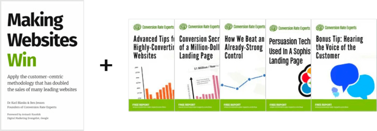
Download a free copy of our Amazon #1 best-selling book, Making Websites Win, recommended by Google, Facebook, Microsoft, Moz, Econsultancy, and many more industry leaders. You’ll also be subscribed to our email newsletter and notified whenever we publish new articles or have something interesting to share.
Browse hundreds of articles, containing an amazing number of useful tools and techniques. Many readers tell us they have doubled their sales by following the advice in these articles.
Download a free copy of our best-selling book
3. Join our team
If you want to join our team—or discover why our team members love working with us—then see our “Careers” page.
4. Contact us
We help businesses worldwide, so get in touch!
© 2026 Conversion Rate Experts Limited. All rights reserved.
A Brandwidth Group Company.